
In this lesson we will keep it short as i will be telling you about a few things on how you should be mastering the forex chart. The image below is from tradingview.com where I do all my technical analysis.
I use trading view because it is more easy to use with a very friendly user interface and lots of tools and indicators.
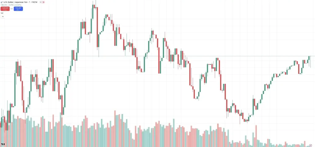
Now this is how a forex chart looks like, there are different types of charts available like bars, candlesticks, lines and more. When you use a line chart, whatever movement that goes on in the market is represented by a line as I have shown you in the image below.
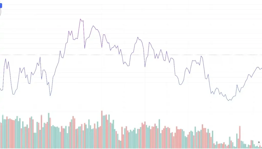
When the line moves up it means that the price is moving up or the price is on the rise. Also when the line moves down, it means that the price is moving down or falling. In the same way when you use a candlestick chart as seen in the first image above.
A candlestick shows the price movement in the market. The moves are more good for technical analysis. With that said, I use candlesticks and I want us to learn about it.
A candlesticks basically has two main components or parts which are the body and the wick or shadow. The image below shows you what the body and the shadow or wick looks like. The body shows the open price and the closing price of the candle.
The candlestick represents the highest or lowest end the candle has moved. Just as the image below, the body of the candle started from 1.43820 and ended at 1.43701. It means that the opening price of the candle price is 1.43820and the closing price is 1.43701
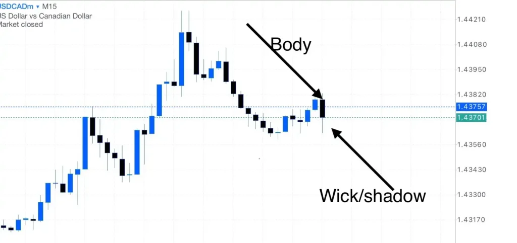
In the image you can also see the wicks or shadow that the candle has created, this represents the highest price and the lowest price of the candle before it was completed.
If you have the chart on a daily settings, then each candlestick represents one day with the open price being the first price traded for the day with the close price being the last price traded for the day.
In they same way, if you move to a 4 hour chart, one candle will take 4 hours to complete and if you move to the one hour chart, it means a candlestick will take one hour to complete.
Now I know many of you may be wondering why there are different kinds of colors to the candlestick because some are green and some are read. Just so you know, there are two types of candlestick and they are:
Bullish candlesticks in the forex chart
The candlesticks that you see moving up, in our case the green candlesticks are called the bullish candlesticks or a bullish price movement. This is named after the bull because they are always known to lift their horns.
Bearish candlesticks
When the price moves down, it’s called a bearish candlestick and the price movement is called a bearish price movement. This is also named after the bear because the bear always has it head down looking for its prey.
Also note that you can set the candlestick colors to any colors that you desire. In my chart, the green candlesticks represents the bullish candle movement and the red candle represents the bearish candle movement.
Moving forward, there are three different types of markets. An up-trending market or bullish market, down-trending market or bearish market and the ranging market. When the price keeps moving up continuously for a few days, it’s called an up-trending market or a bullish market.
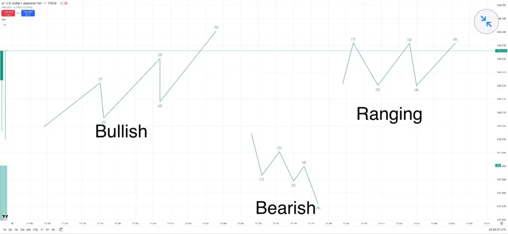
When the price keeps moving down for a few days, it is called a down trending or bearish market. Lastly, if you see that the price is moving sideways, it is called a ranging market. The image above let’s you understand what I am talking about.
These are a few basic things you should know on a forex chart, you should know each of these and also understand them before you can start trading forex. Thank you and I’ll see you in the next class.
In case you missed the previous class, there’s a link to that below as well as a link to the full course.
Previous class: Swap And Leverage In Forex Trading | Full Details
Full course: Forex for beginners
Pingback: How To Use MetaTrader 5 | Guide To MT5 - 7educate.com